SRAM
Redesign of the informative website of SRAM, an organization that manages admissions to colleges in the greater Montreal area.
January - march 2020
ClientProject realized for the SRAM.
Expertises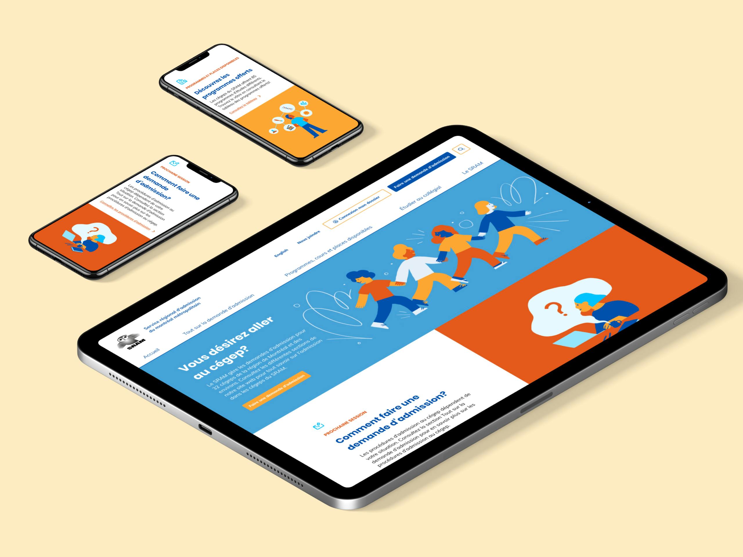
About
SRAM is a public organization that aims to centralize the college admission process for students from across Quebec. In addition to assisting students in registering among the 32 member colleges, it also provides information on available programs and support to guidance counsellors.
Collaborators
UX analysis : Catherine Roy
Illustrations : Maylee Keo
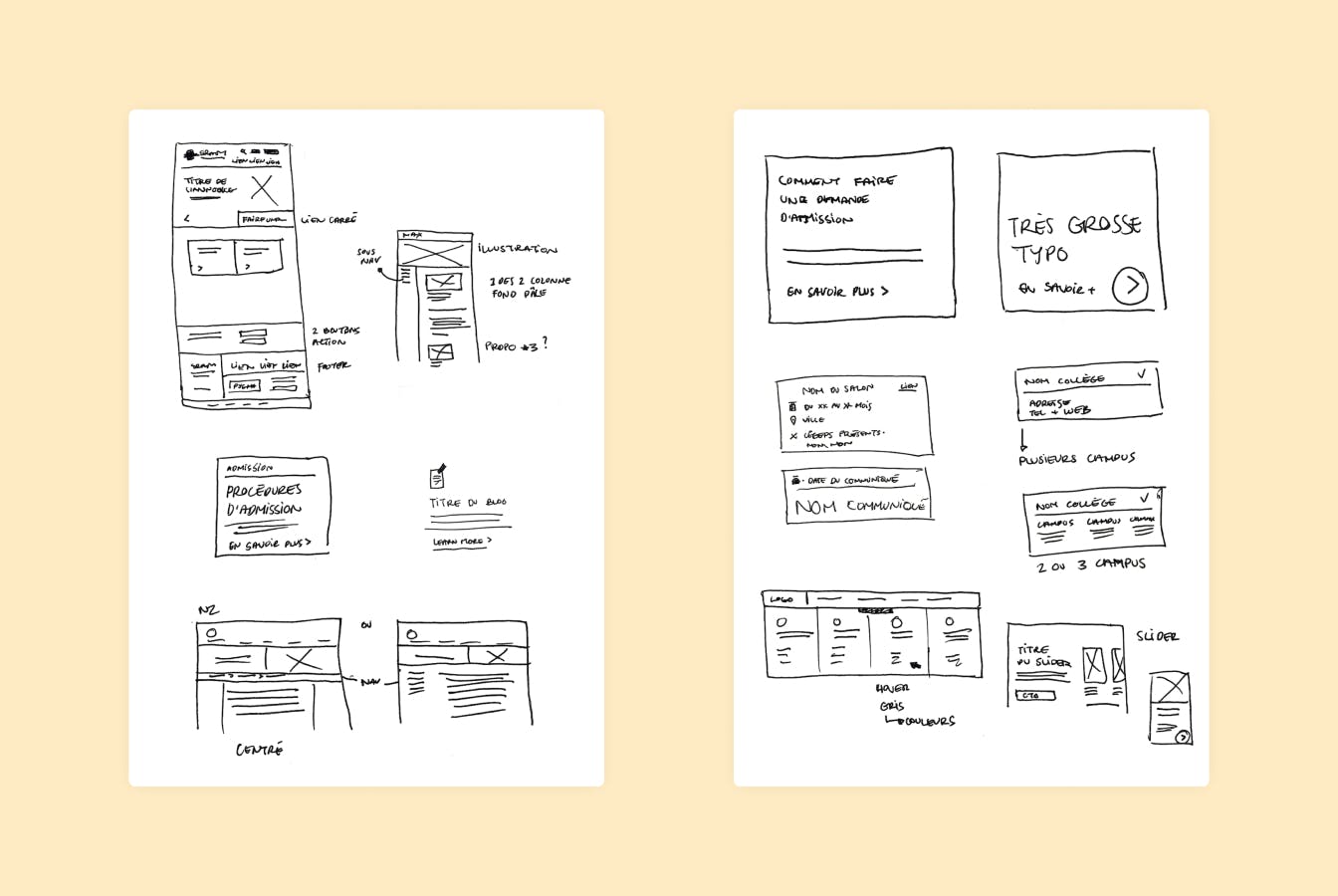
Preliminary explorations of interface elements for content integration.
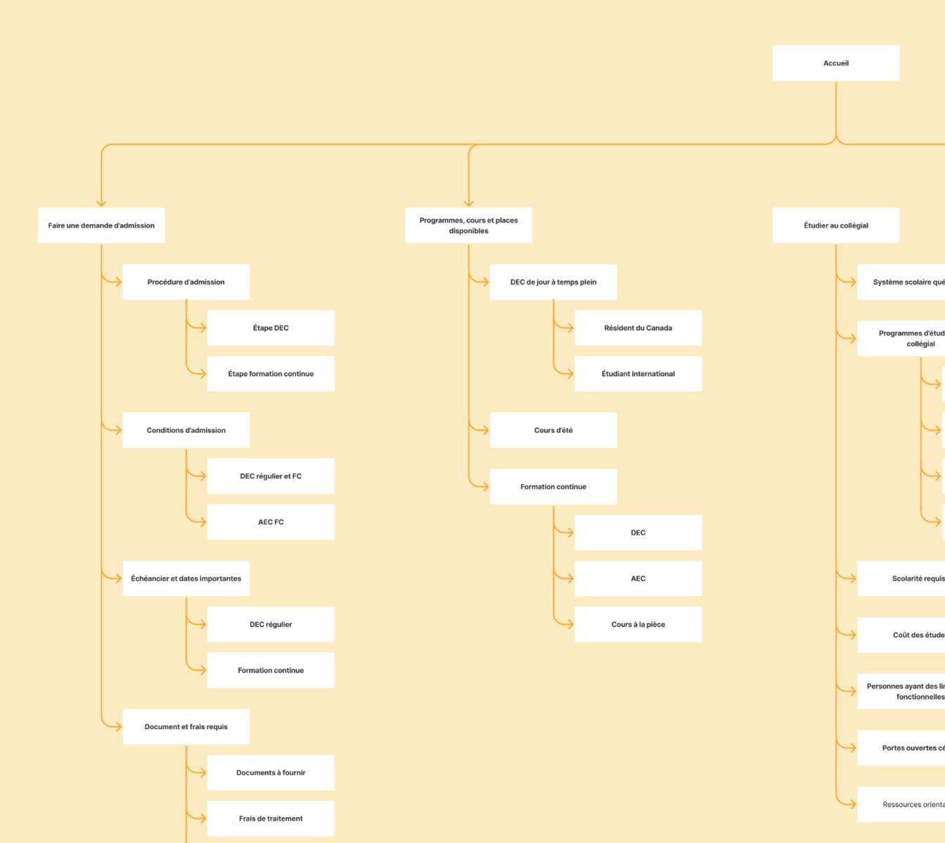
Overview of the new information architecture and structure.
Context
I was approached, in early 2020, to assist SRAM in the process of redesigning their website. They wanted to update their website while integrating a new information architecture and content improvements previously done with a UX designer.
The new artistic direction needed to be minimalist but bold, and to integrate the responsive aspect in order to better reach the target audience, i.e. young people looking to register to college. It is also essential to take into account the accessibility of the interfaces to be produced in order to allow the majority of users to have access to SRAM's content.
My role
- Art direction and user interface
Main tasks
- Redesign of the artistic direction of the SRAM information site, while reflecting the information architecture and structure defined before the project
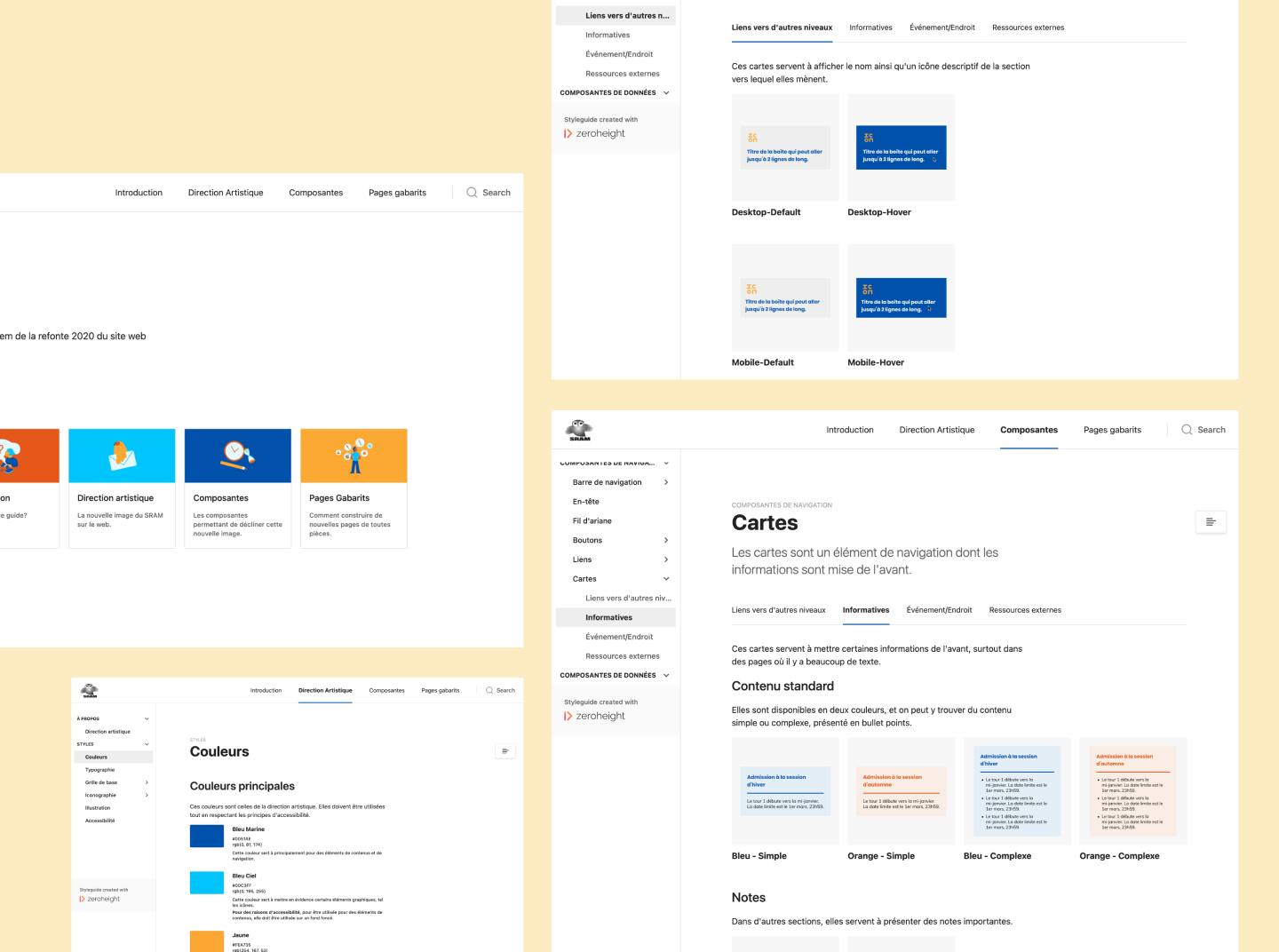
- Implementation of a design system to facilitate integration and allow the SRAM to be autonomous in the creation of new pages
- Creation of mock-ups and prototypes of the new site for the mobile and desktop versions
Challenges
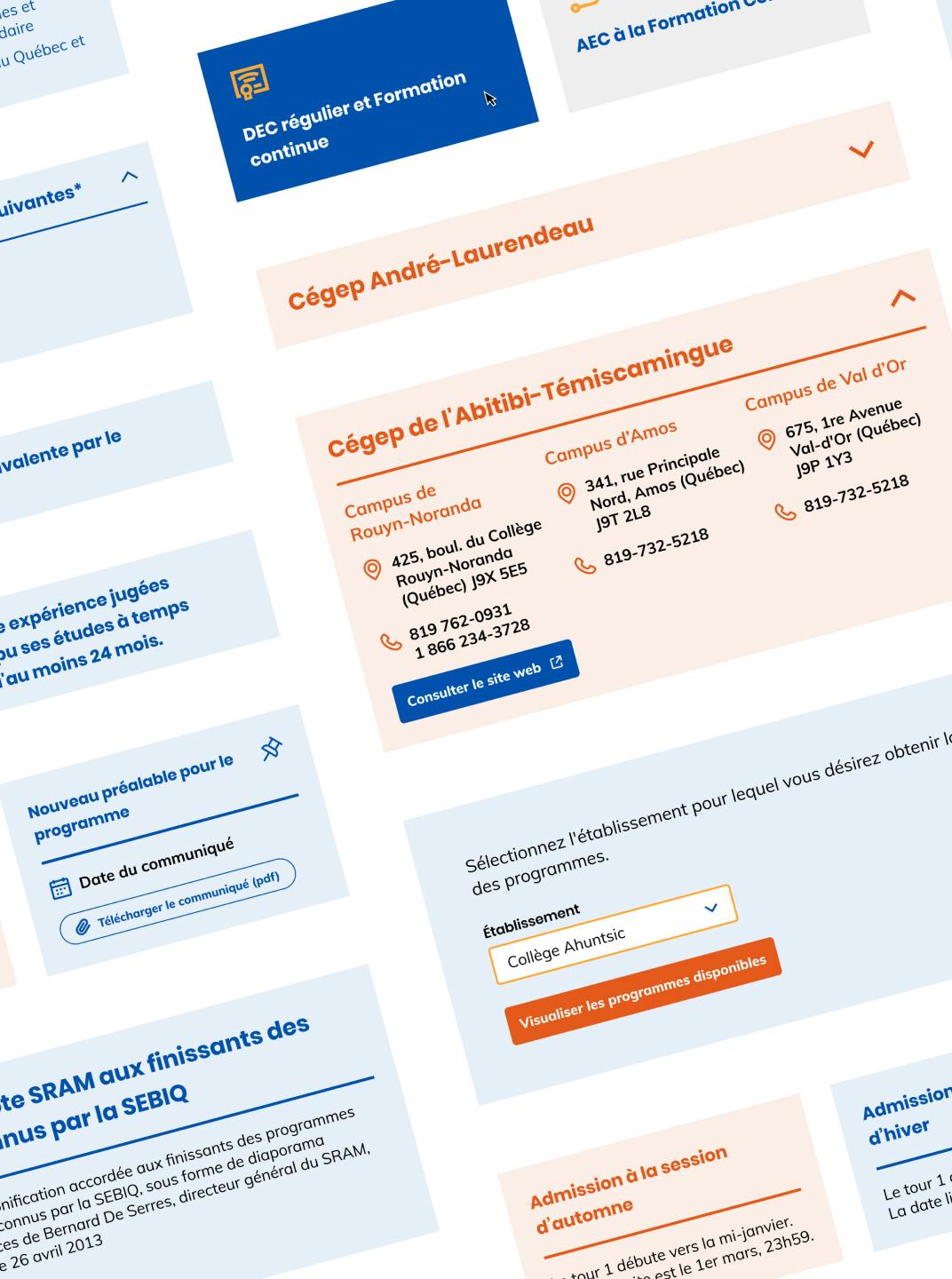
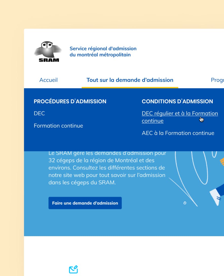
The main challenge of this project was to make the content attractive to the users and easy to consult for the users, since it is present in large quantities on the site. To do so, a type hierarchy was established for the different levels of titles and texts, in order to help users better find their way through the text. In addition, functional elements such as boxes or colored drawers help to highlight the most important information on certain pages, and to help sort certain information as well.
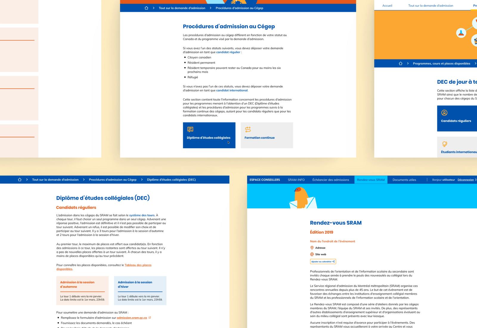
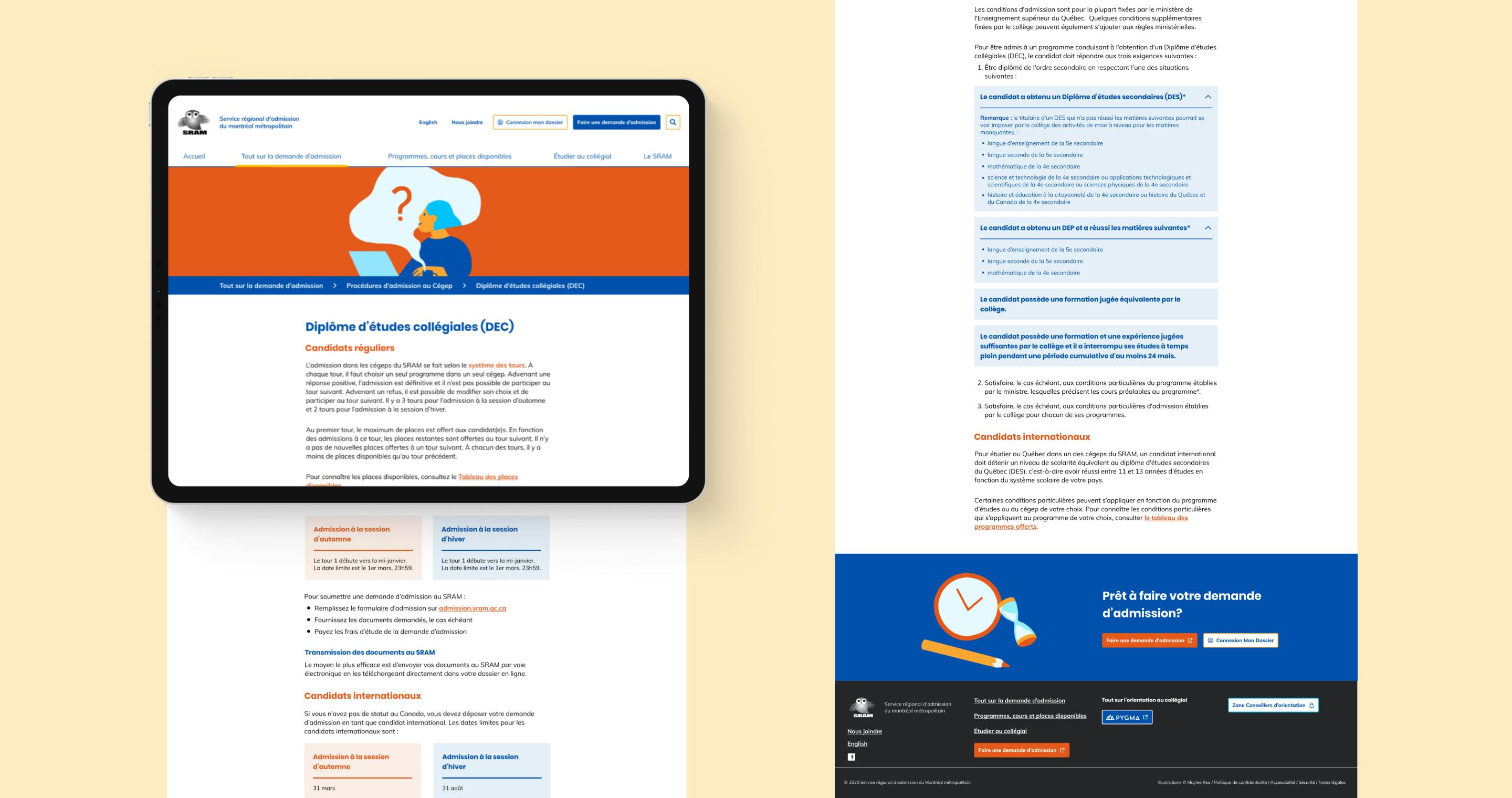
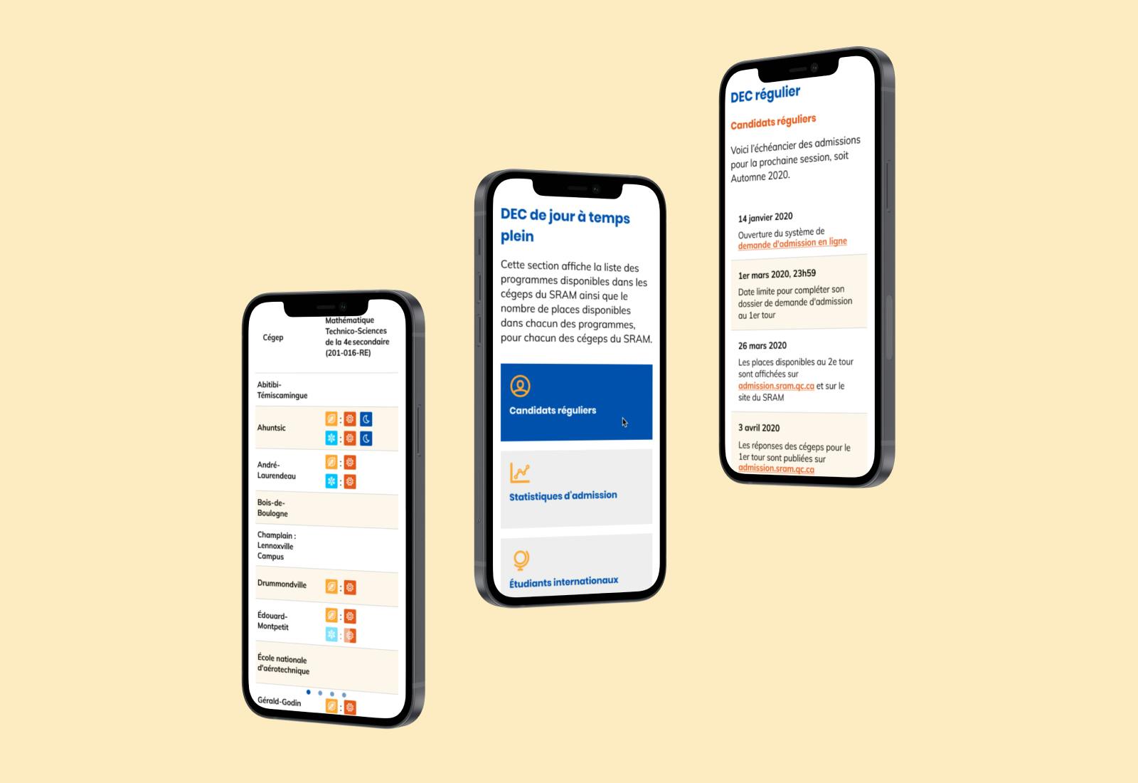
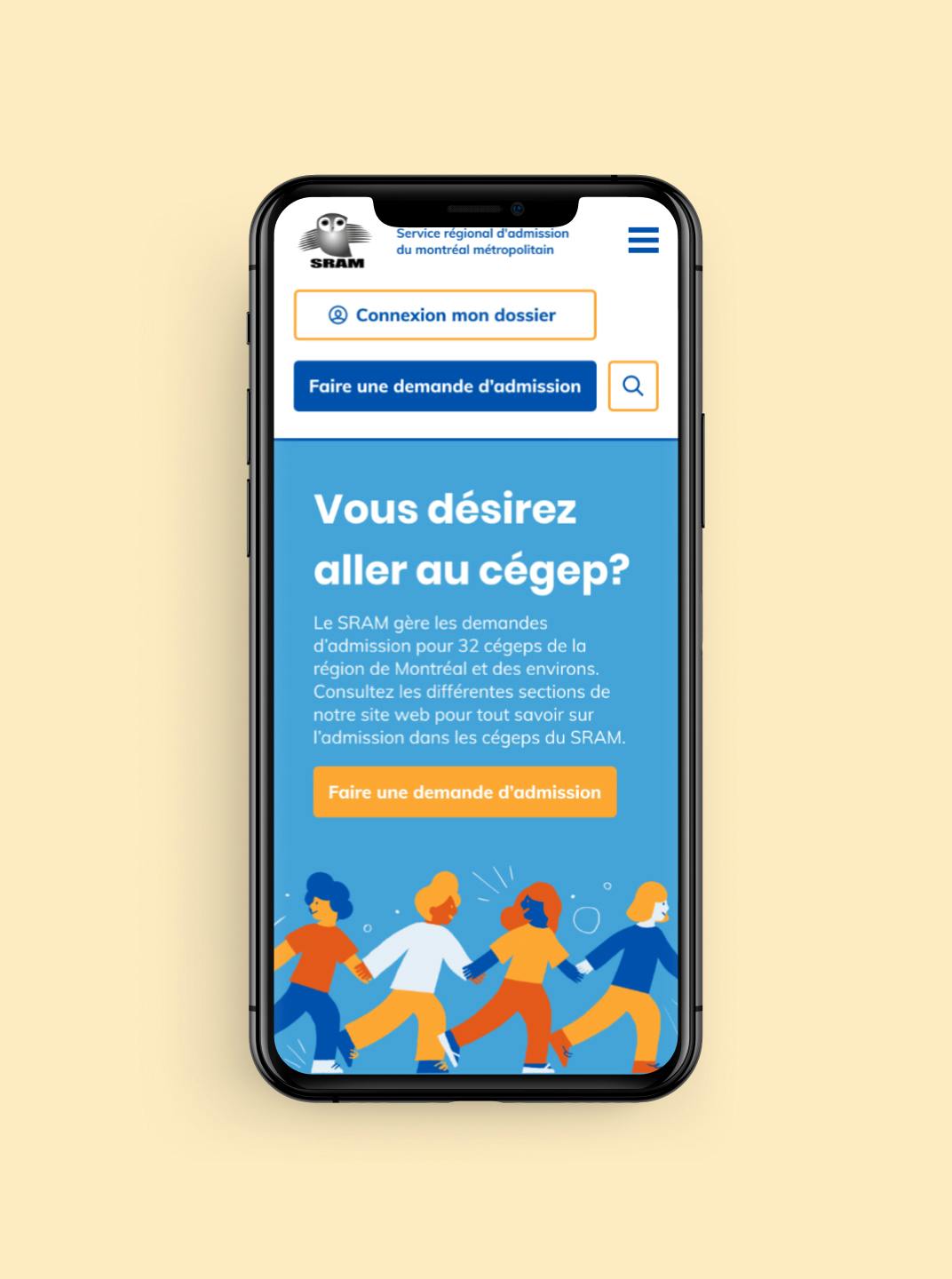
Final look
The proposed solution is a layout with a simple content grid, but which integrates elements with bright colors. A palette of blues with elements of orange and yellow accents, while allowing the content to remain accessible to all users.
Illustrator Maylee Keo was commissioned to create colorful images with a touch of geometry that accompany the main sections of the site.
In addition to the mobile and desktop pages that were created, a design system was put in place to document the various functionalities of the site and to allow the SRAM team to be able to add new content or new pages to its website independently.